Project Background:
In 2022 the agency I worked for, Phenomenon Detroit, decided to rebrand the company to Posthuman as an effort to signal a new era in how they operated as a business. The idea behind it was to create a full service marketing and design agency that utilized technology in it's fullest to both speed up the process and keep costs significantly down. The powers that be wanted the brand to highlight how when technology is put into the right hands, amazing things can happen.
My Goals for The Brand:
To meet this vision, I made sure that the branding was designed around 3 key pillars that would guide the full branding:
1. Screen Focused Design: Because clients and employees mostly engage with the company in a digital manner, the brand should focus on appearing best on screens.
2. Digital Symbiosis: What makes the company effective is not the technology that it uses but rather the people who use that technology. The branding should represent Posthuman's ability to find balance with both the physical and digital world.
3. Social Elements: A huge part of brand engagement these days are primarily done thought social media. Embracing design elements from apps like TikTok, Instagram, and other networks communicates Posthuman's knowledge of the space while helping it maintain a more authentic look.

The Brand Building Blocks
The Logo
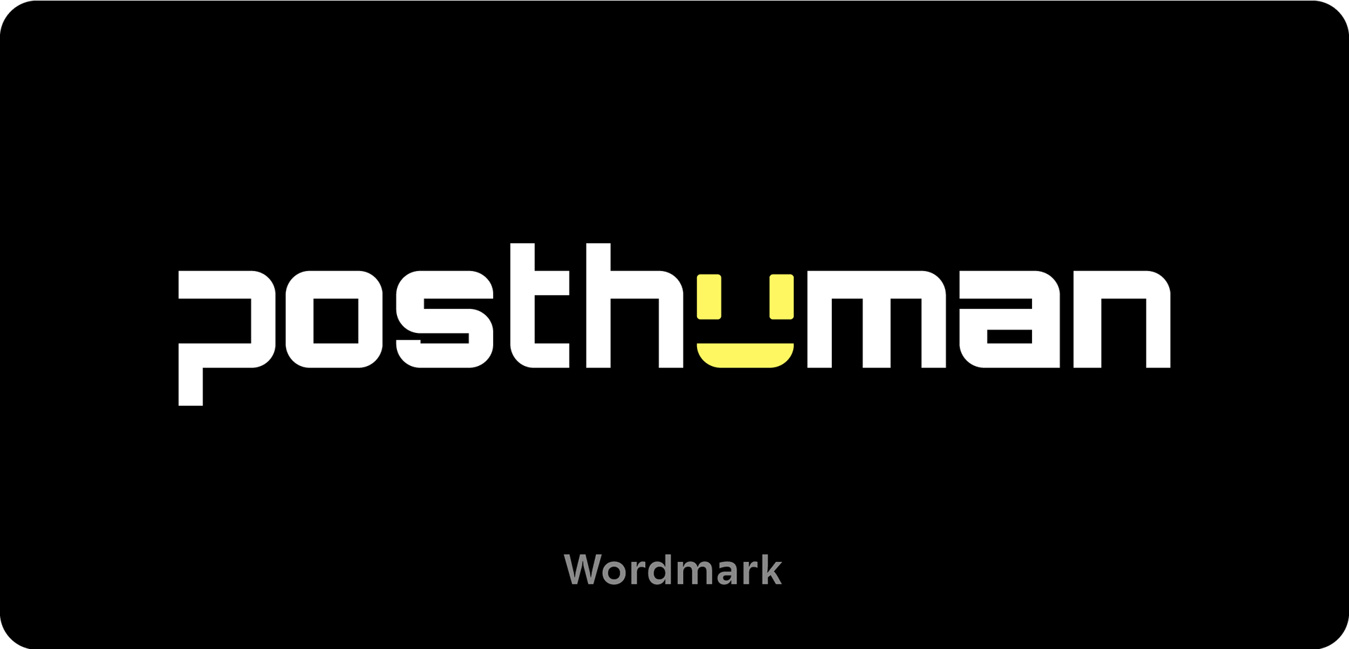
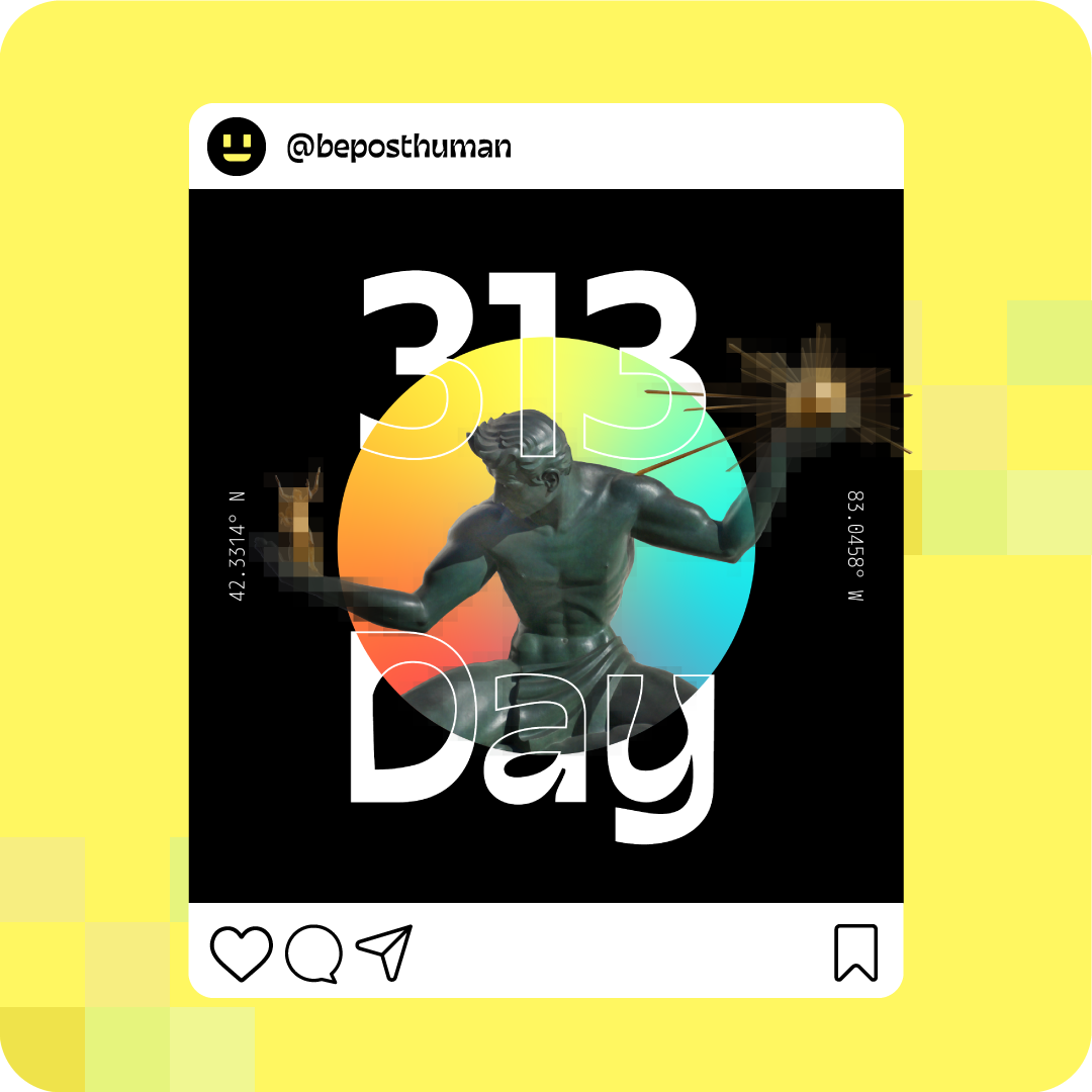
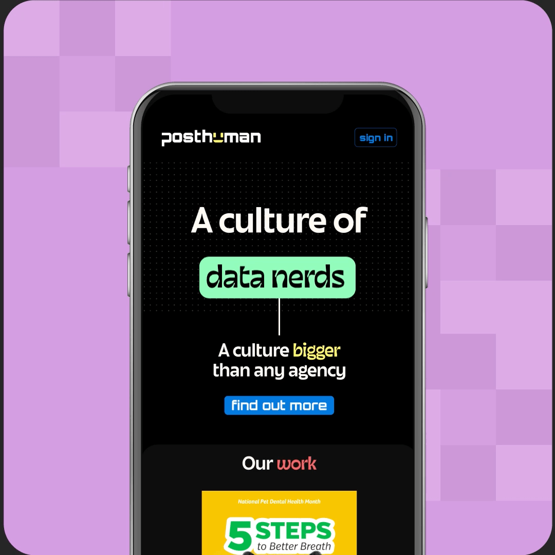
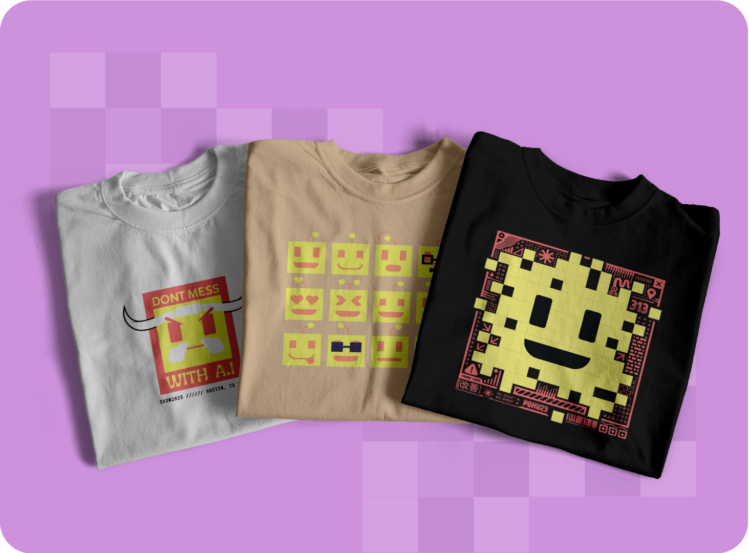
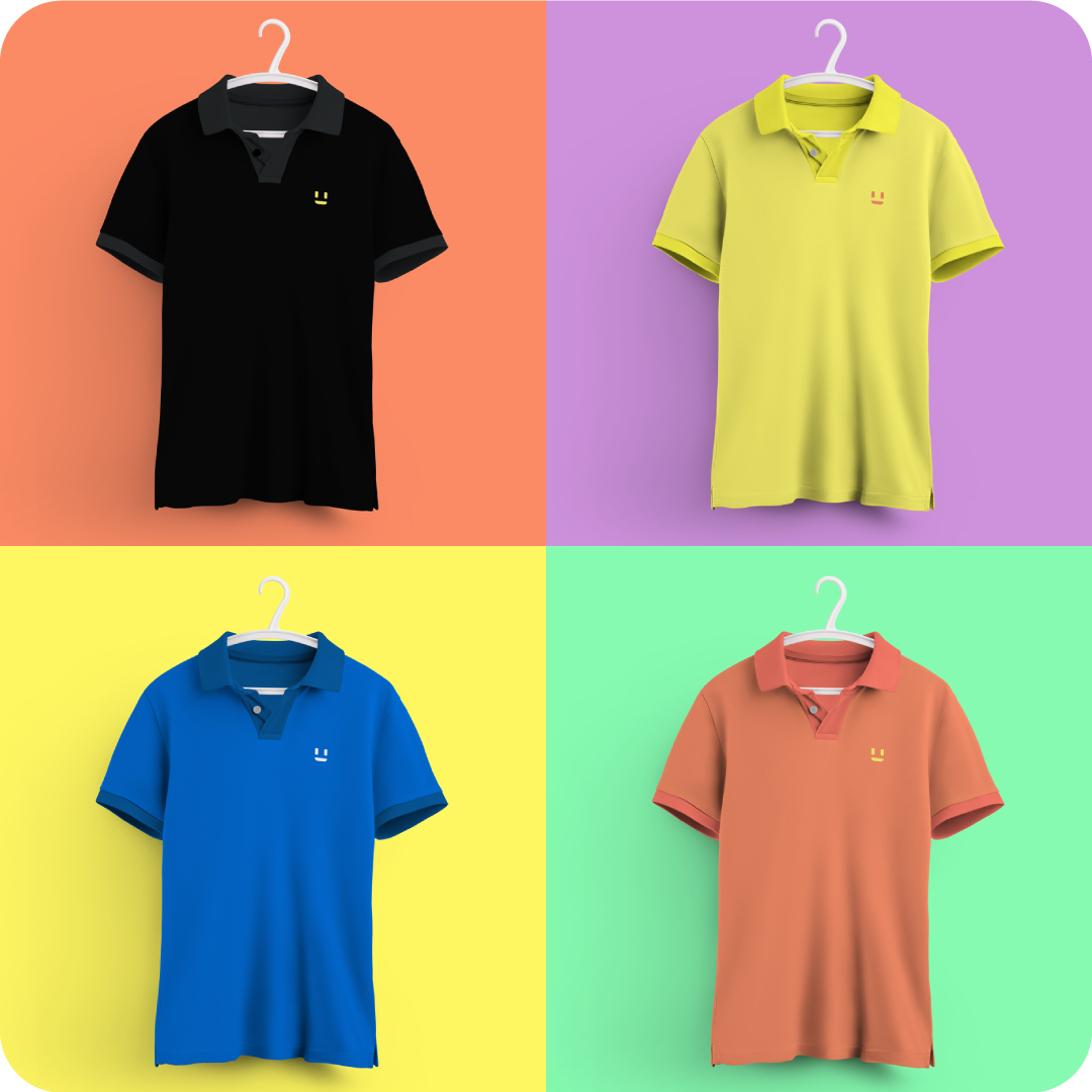
The primary Wordmark and Icon are both derived from Orbitron Bold in lowercase. Part of the stem is removed from the "P" on Posthuman to bring it more balance with the open "N" shape at the end. Part of the U was also removed which helped create the face used for the icon.
Screen Focused Design
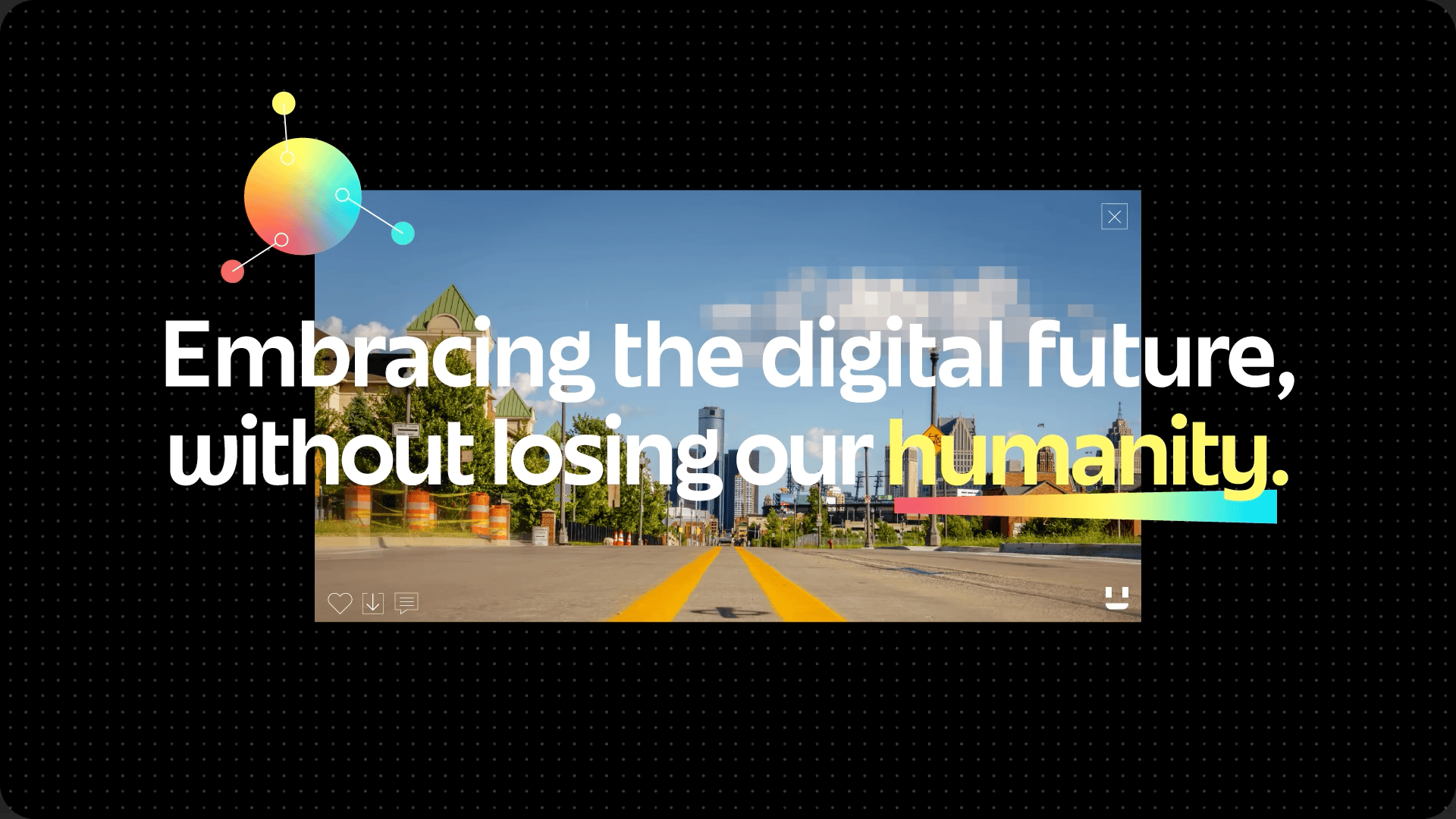
Did you know that 60.67% of internet traffic comes from mobile devices [1] and that 81.9% of smartphone users use darkmode [2] as their preferred system skin? This ultimately influenced the design's color pallet, opting to go for a pure #000000 black background since that color doesn't light up any pixels on OLED screens. Red and Yellow were chosen as the primary based on the studio head's favorite colors, the blue CTA shade was chosen based on the color's history of converting click as well as conveying trust [3], and the rest of the accent colors were chosen to give the color pallet a complete rainbow color pallet representing the full spectrum of services that the company offers.
[1] https://explodingtopics.com/blog/mobile-internet-traffic [2] https://earthweb.com/how-many-people-use-dark-mode/ [3] https://optinmonster.com/which-color-button-converts-best/


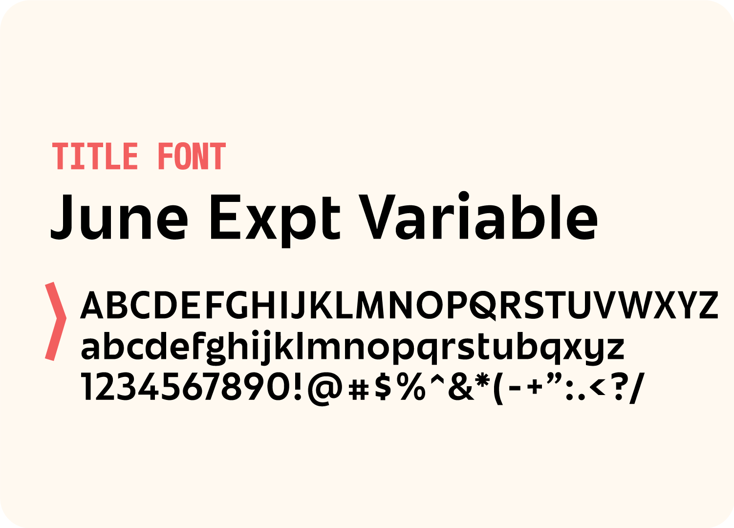
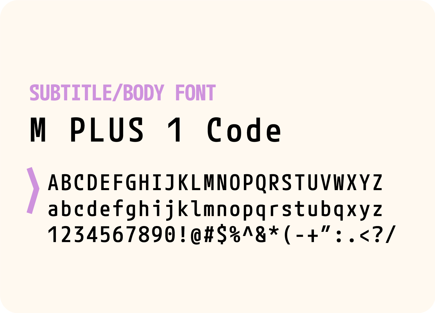


I landed on 3 different fonts to be used in the branding identity. The first of which is is the title font that goes by the name of June Expt Variable. I ultimately landed on this font for a few different reasons. It's a bold, legible, friendly sans-serif with the most charming V's and W's I've ever seen. Also, as the name suggests, June is a variable font which transitions from this very rigid, clean, manufactured letter into a very loose, organic, and human like shape. Perfectly representing the symbiotic relationship of out digital and analog worlds. M Plus 1 Code was chosen as the subtitle and body copy thanks to it's versatile weights and tech themes, and Orbiton as the CTA.
Digital Symbiotic Theme
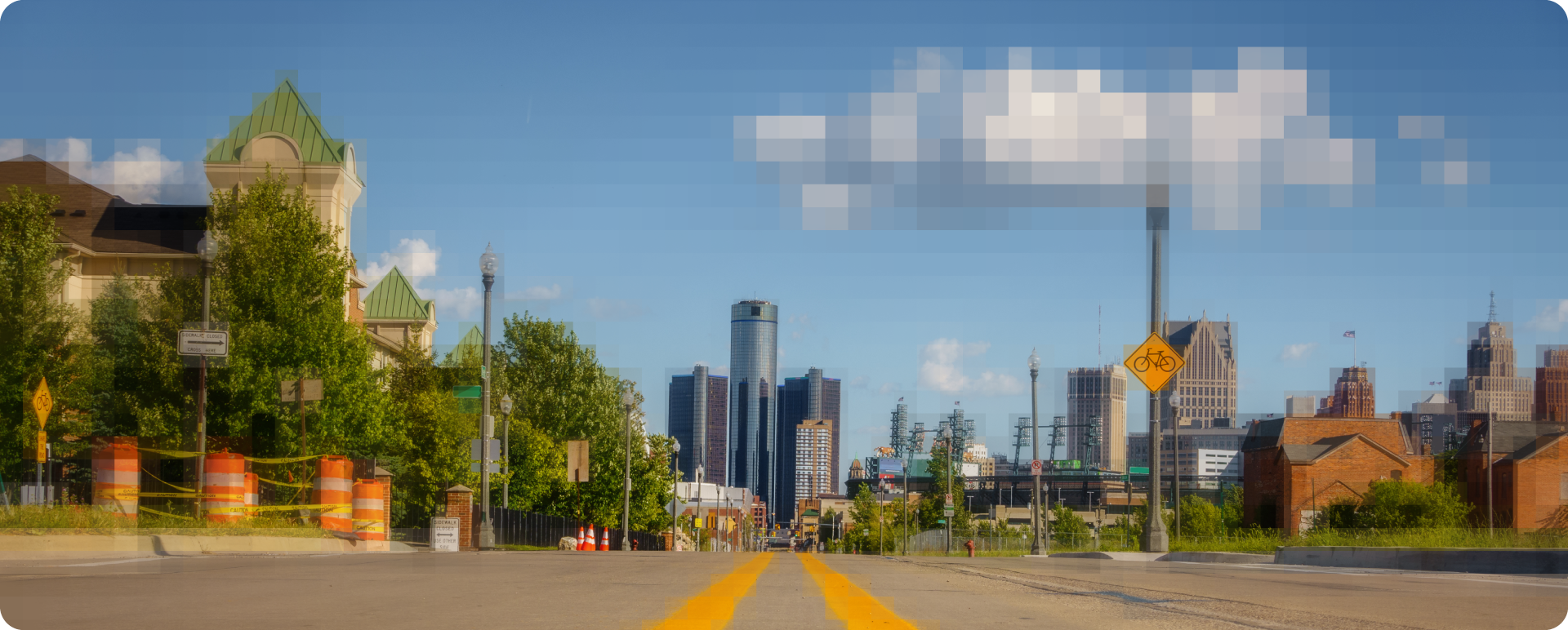
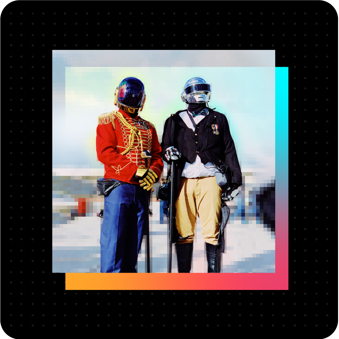
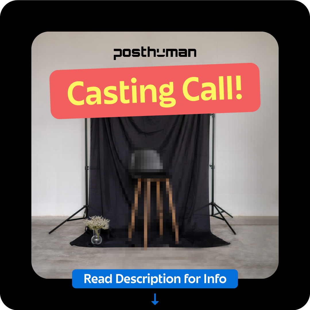
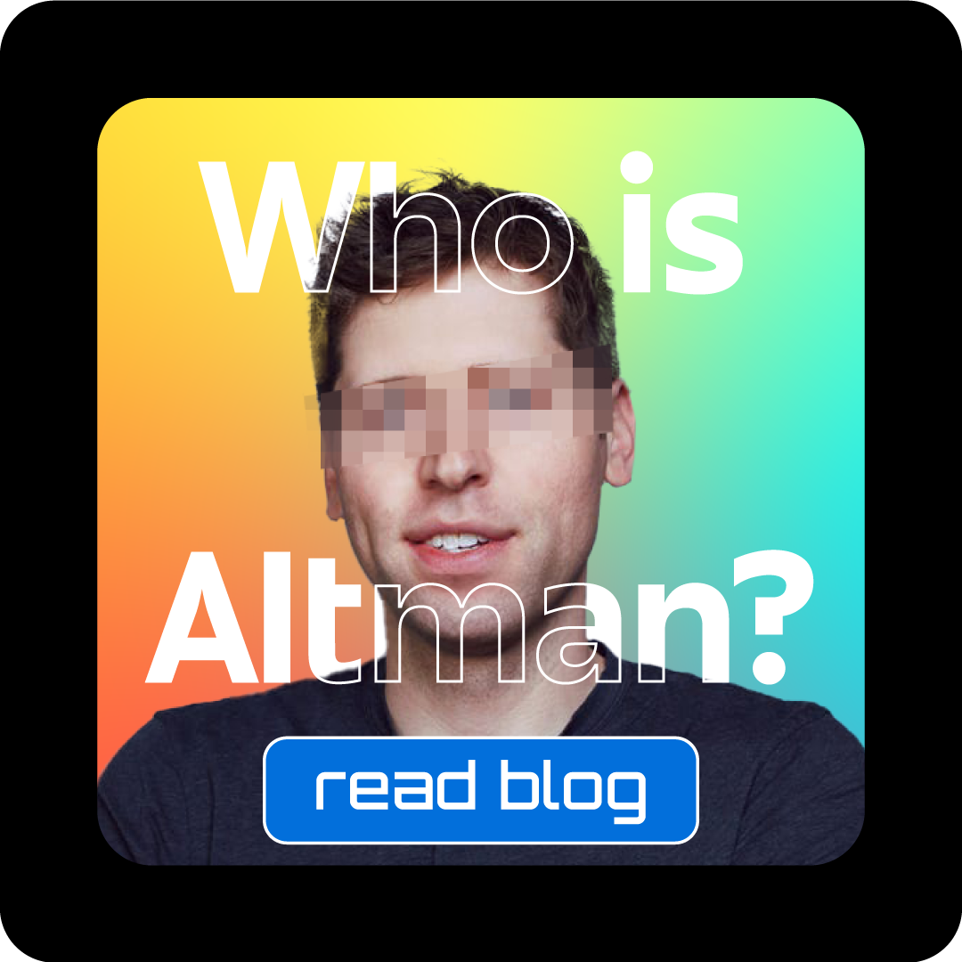
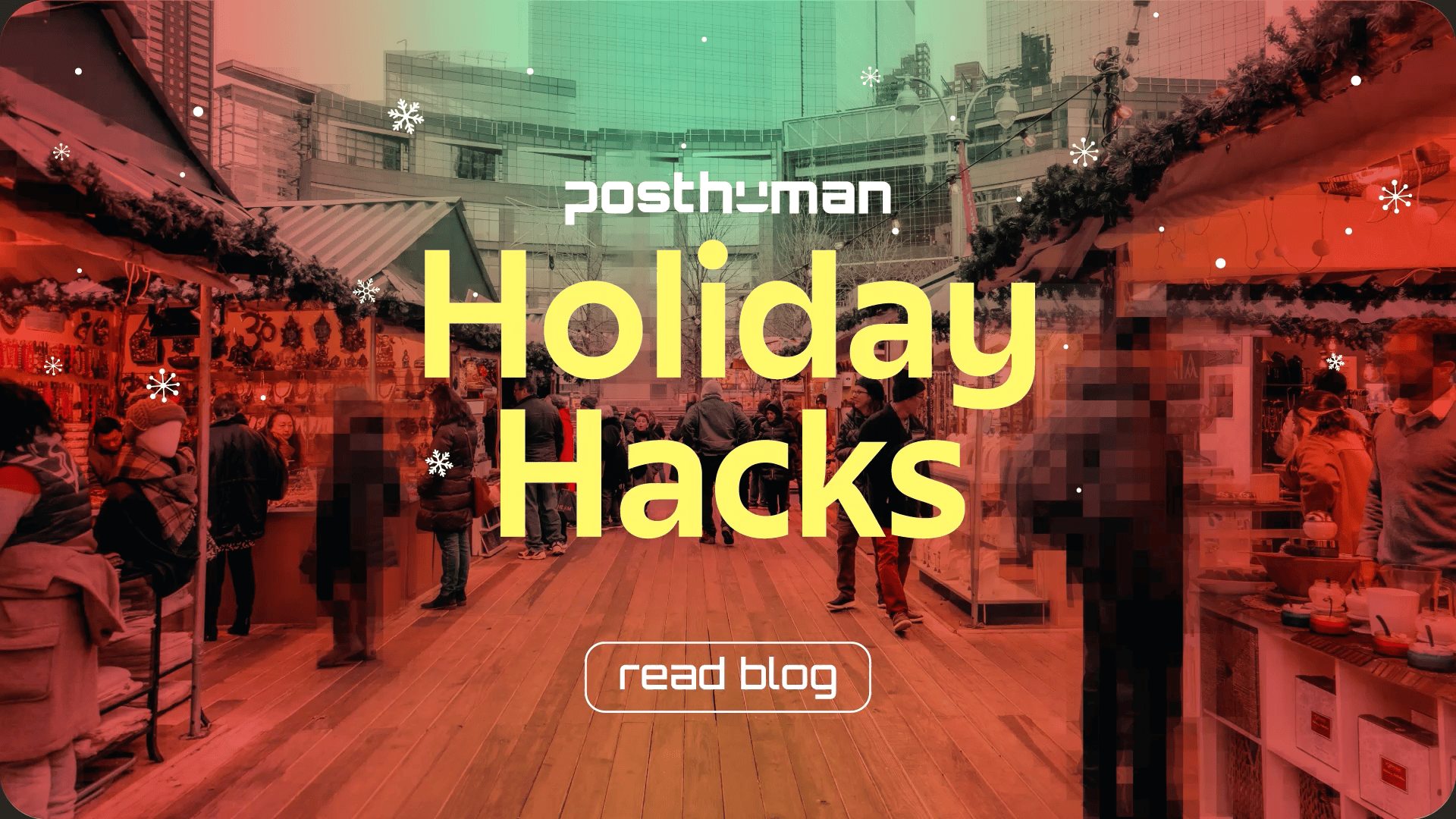
Besides the title font, another way the brand pushes forward the symbiotic relationship between our two worlds is through the photographic style treatment. Photos should be edited in a way that looks like elements of our digital world are breaking though the multiverse, taking over objects in a seemingly natural way, as if our world has always looked that way. This is done through selectively pixelating some items in the scene or imposing digital elements within the world itself.


Social Elements
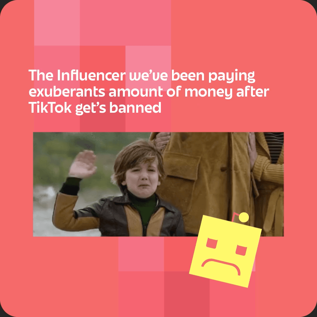
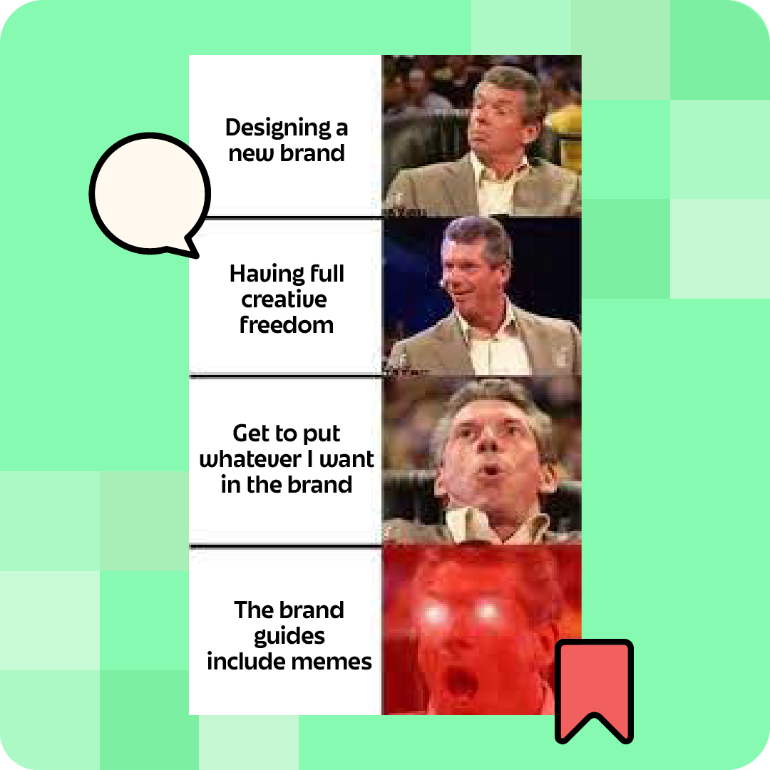
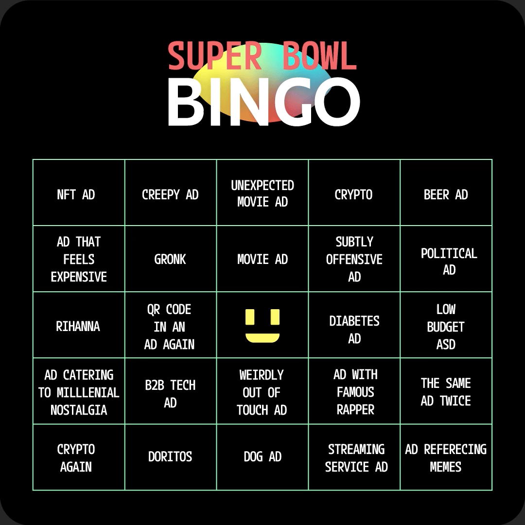
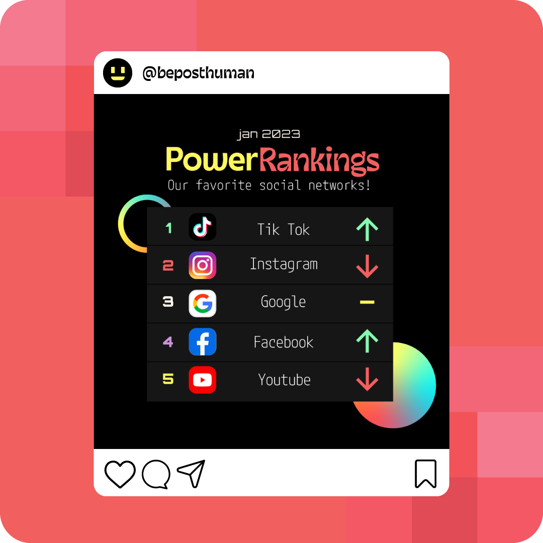
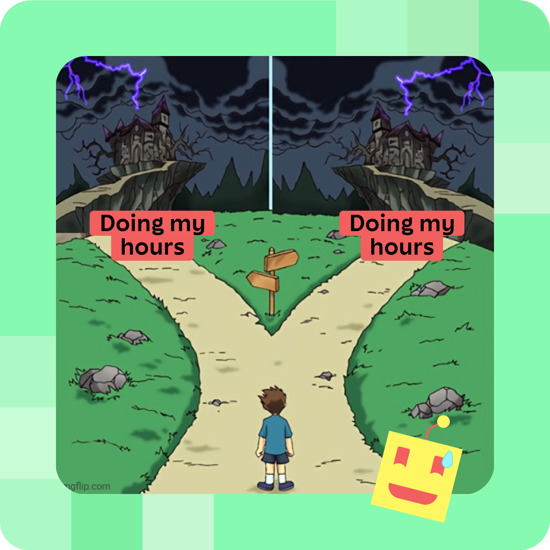
Last, but not least, is the binding element to tie all of that together. Anyone who's worked in marketing or advertising in the past 5 years should know that there is an element to User Generated Content (UGC) styled posts that simply performs better than traditional content [4]. So why not take lessons from that and and make it one of the core pillars of the brand? The elements I ended up incorporating into the brand were the use of bubble text, memes, gifs, icons, and a custom emoji set to use as reaction stamps.

[4] https://getflowbox.com/blog/user-generated-content-statistics/

Look and Feel
How the 3 pillars of the brand look when combined into a single system.
Social Media

Website/Blog


Clothing and Memorabilia


Let's make something together!
